Setting up
Designs, pages and menus
The three Charity designs (Impact, Civic and Hope) and their colour palettes, the starter pages and main menu the kit makes, and how the site looks on a phone.
On this page
The Charity theme comes with three designs. A design sets the fonts, shapes and mood of the whole website; a colour palette sets the accent colours on top. You can change both at any time without losing any content: your campaigns, pages and volunteers stay exactly as they are.
This chapter shows each design and lists the pages and menu the kit makes for you. For the general steps (logo, sticky menu, footer, editing menus) see Your look.
The three designs
You'll find them under Site Settings → Design & colours. Each card has a short description.
- Impact leads with proof: big wide numbers, progress bars and square corners, the live campaign card with amount buttons at the top of the home page, a dark band of the year's figures, the bright appeal strip and a hard shadow on the donate card.
- Civic leads with trust: a public-service style with the charity number in a top bar, a navy header with search, the appeal as an alert strip, "At a glance", numbered sections with "On this page", tables, a monthly chart, trustees and documents.
- Hope leads with people: a warm serif font, arched and round photos, soft colour fields and pill-shaped buttons, a day at the hall hour by hour, stories in tabs, volunteer faces on a deep band and "letters" by email.
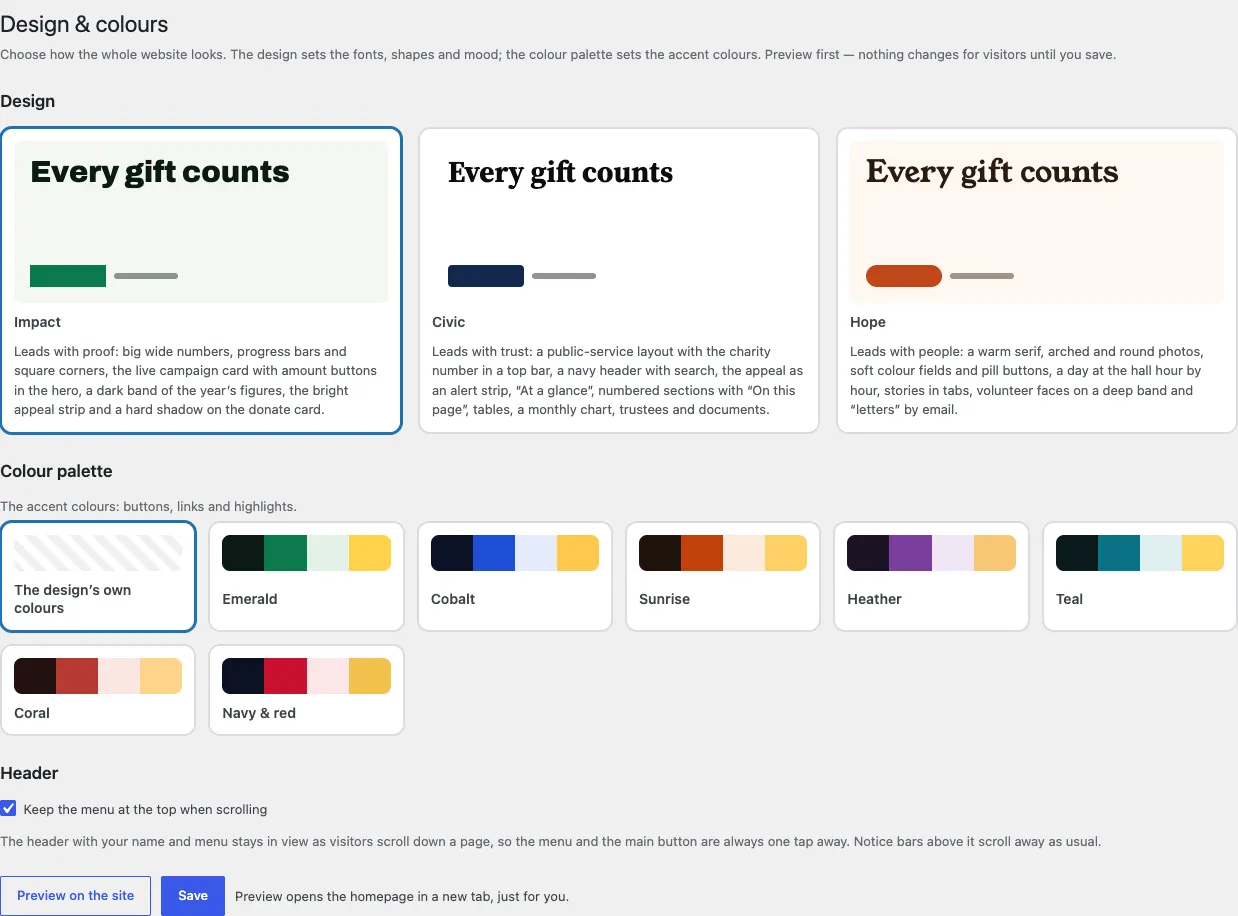
Impact
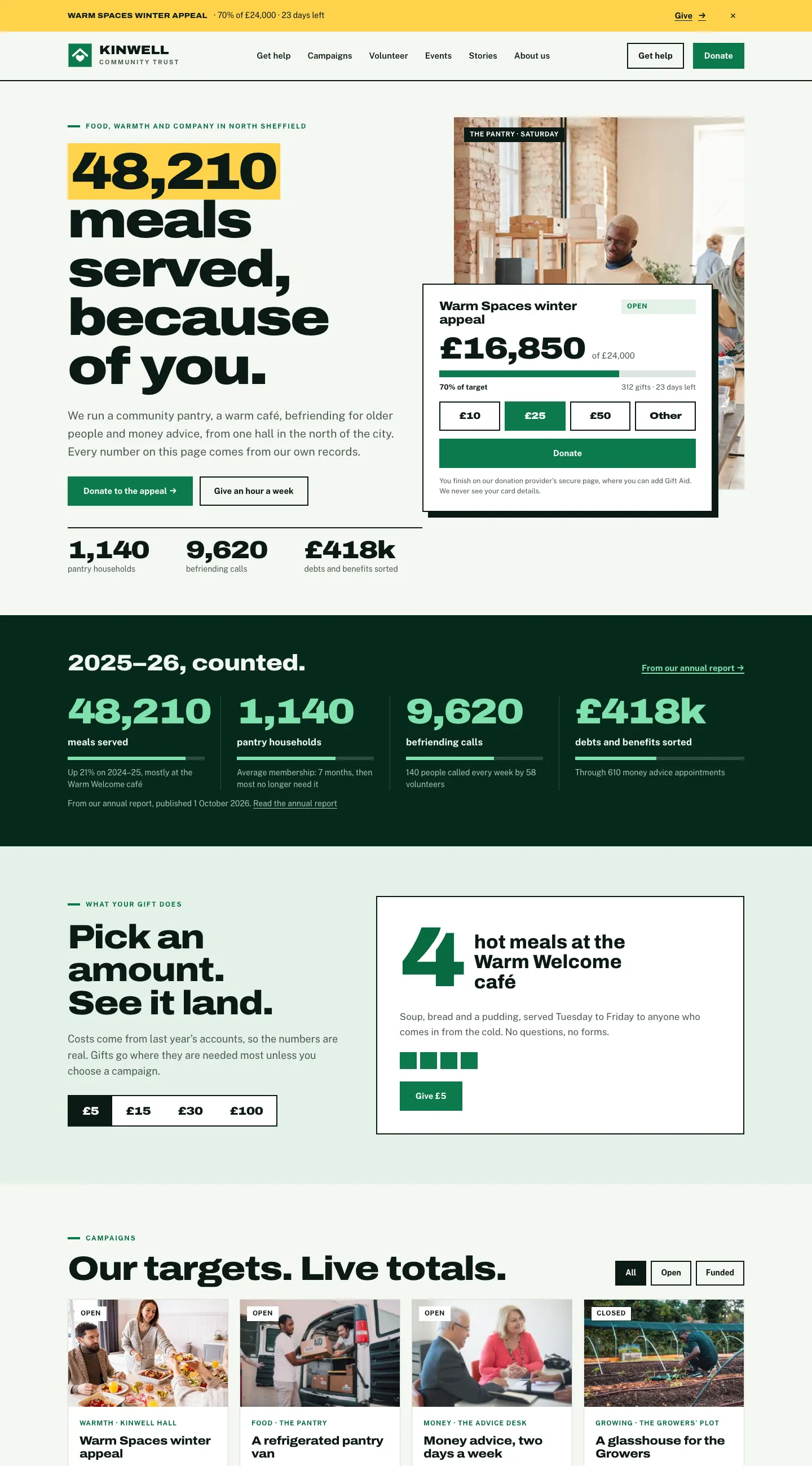

Civic
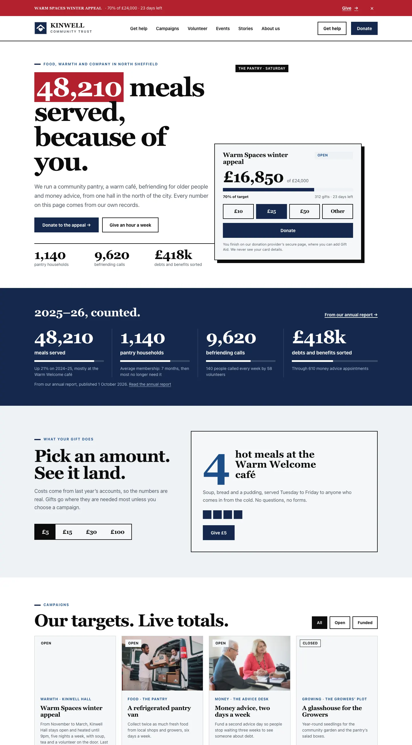

Hope
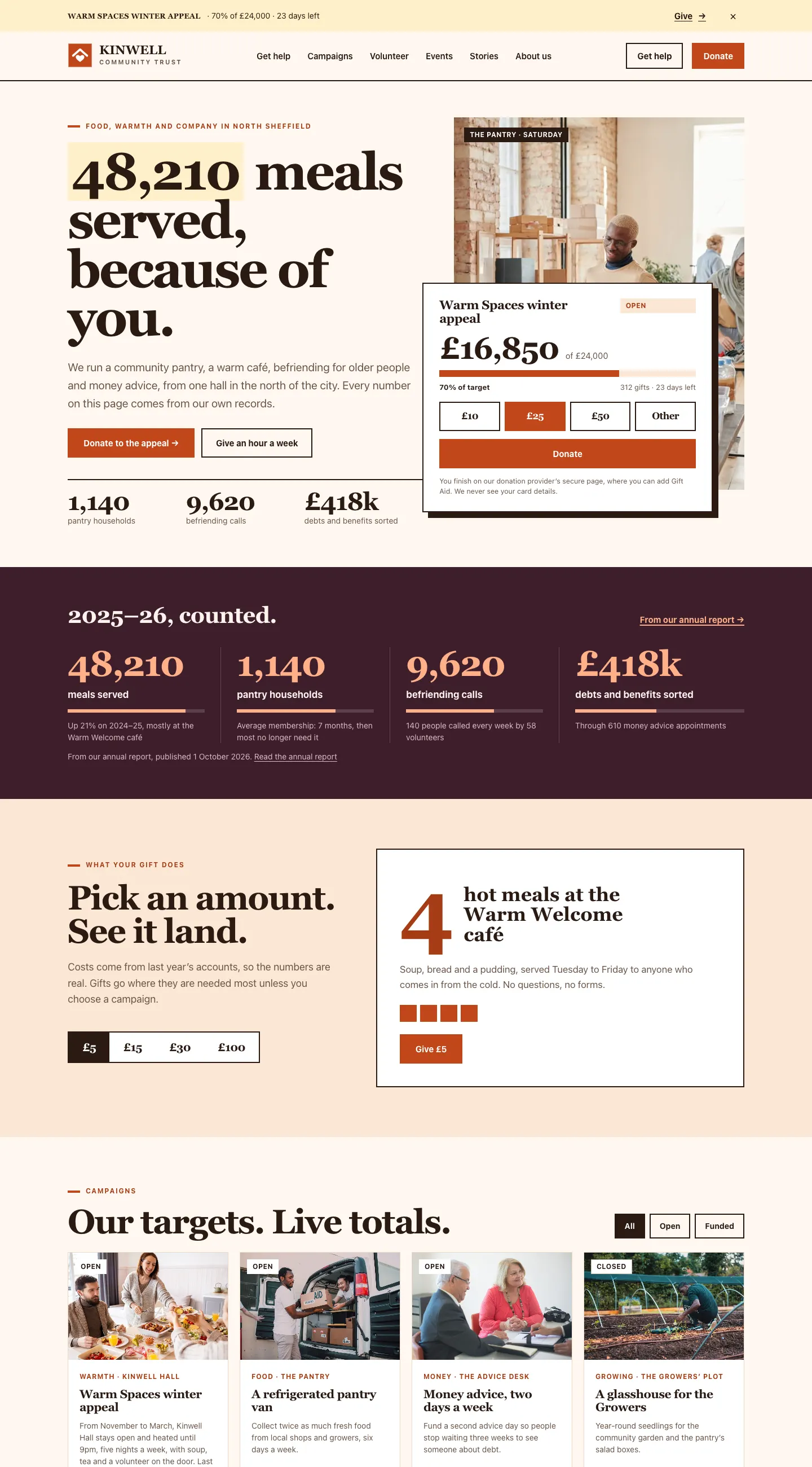

Colour palettes
Each design has its own colours plus seven palettes: Emerald, Cobalt, Sunrise, Heather, Teal, Coral and Navy & red. Choose The design's own colours to keep the design's original look.
How to change the design or palette
- Go to Site Settings → Design & colours.
- Click a Design card.
- Click a Colour palette.
- Click Preview on the site. The home page opens in a new tab, just for you. Visitors still see the old look.
- If you're happy, go back and click Save.
The sticky menu
Under Header, Keep the menu at the top when scrolling keeps your name, menu and Donate button in view as visitors scroll. Notice bars above it, like the appeal strip, scroll away as usual.
The pages the kit makes
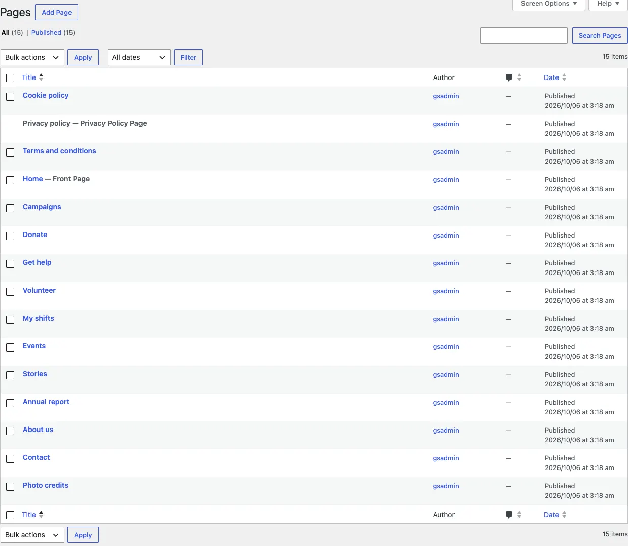
When you tick Starter pages and menu in the setup wizard, the kit adds these pages (pages you already have are left alone):
| Page | What's on it |
|---|---|
| Home | Your headline figures, the featured campaign card, what your gift does, campaigns, services, stories, shifts, events, places, where the money goes and the newsletter sign-up |
| Campaigns | Every campaign as a card, with All, Open and Funded filters |
| Donate | The donate panel for general gifts and "What your gift does" |
| Get help | Your services and where to find you |
| Volunteer | Roles, shifts and the volunteer sign-up form |
| My shifts | Each volunteer's own shifts page (Pro) |
| Events | Your events, filters by kind, and the calendar subscription link |
| Stories | Your impact stories |
| Annual report | Your annual reports and figures |
| About us | Trustees, documents and your registration details |
| Contact | The contact form and your places |
It also adds the legal pages (Terms and conditions, Privacy policy, Cookie policy) and a Photo credits page. You'll find all of them under Pages.
The main menu
The main menu has Get help, Campaigns, Volunteer, Events, Stories and About us, with a Get help button and a Donate button on the right. On a phone, the menu opens from the menu button at the top.
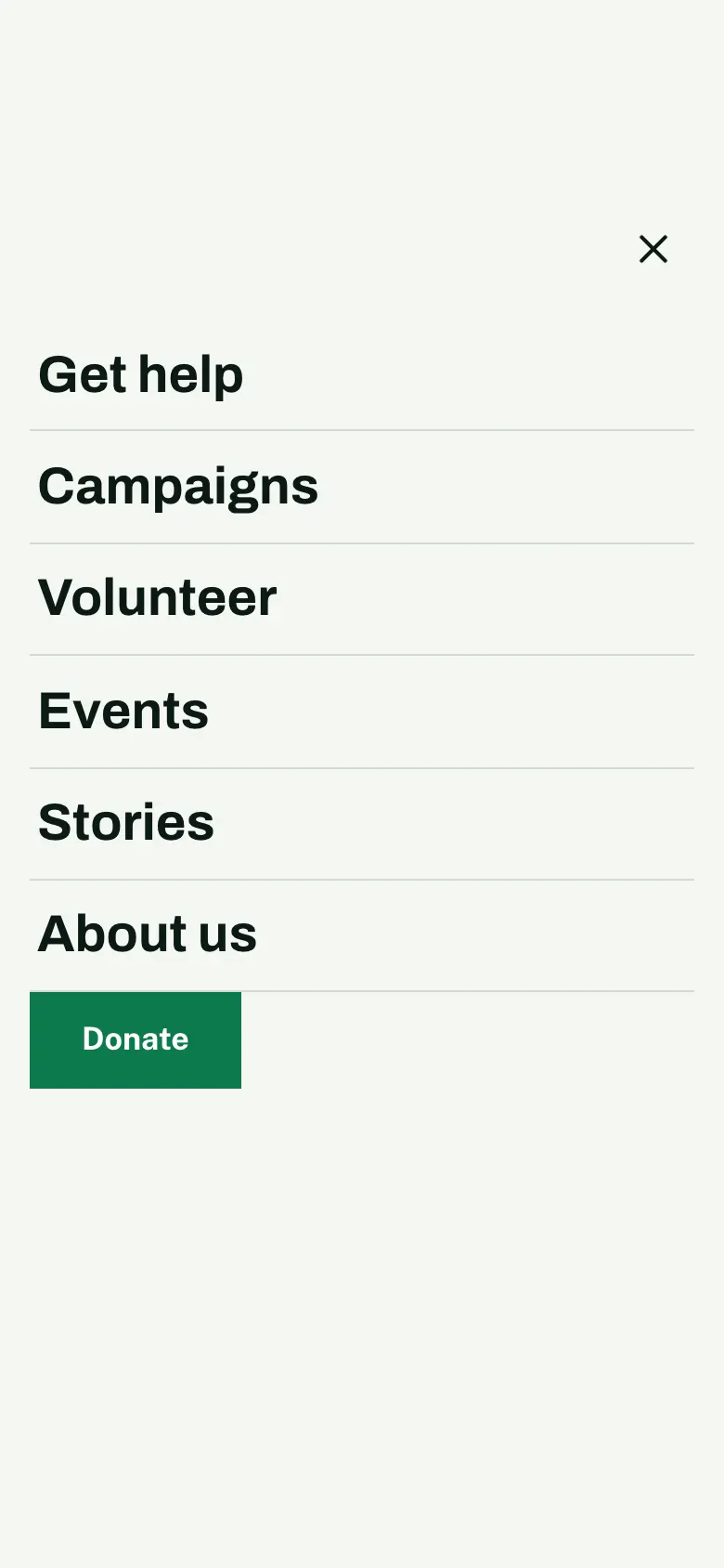
To change the menu, see Your look.
The appeal strip
The slim strip at the very top shows your featured campaign, its percentage and days left, and a Give link. Visitors can close it with the cross; it stays closed for the rest of their visit. You choose which campaign it shows with Feature it in the appeal banner on the campaign (see Campaigns and appeals).

The footer
Every page ends with your address, phone and email, a Donate button, three columns of links (Get help, Get involved, About us) and the legal line: your registered charity number and regulator, company number and registered office, and the Fundraising Regulator line if you switched it on. You set these under Charity → Settings → Your charity and the Business tab (see Settings reference).