Setting up
Designs, pages and menus
The six designs and seven colour palettes of the Church theme, the pages and menu the kit makes, and how to switch the look.
On this page
The Gradespace Church theme comes with six designs. A design sets the fonts, shapes and mood of the whole website; a colour palette sets the accent colours. Your words, photos, sermons and events stay exactly the same when you switch, so you can try them all without losing anything.
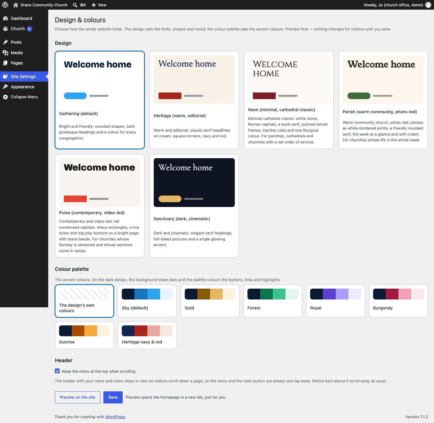
How to choose a design and colours
- Go to Site Settings → Design & colours.
- Under Design, click the design you like.
- Under Colour palette, click a palette, or The design's own colours.
- Under Header, leave Keep the menu at the top when scrolling ticked if you want the menu to stay in view as people scroll.
- Click Preview on the site. Your homepage opens in a new tab in the new look, just for you.
- Happy? Come back and click Save. Nothing changes for visitors until you do.
More about logos, menus and the footer is in Your look.
The six designs
Gathering (default)
Bright and friendly: rounded shapes, bold headings and a colour for every congregation. A good choice if you have several churches.
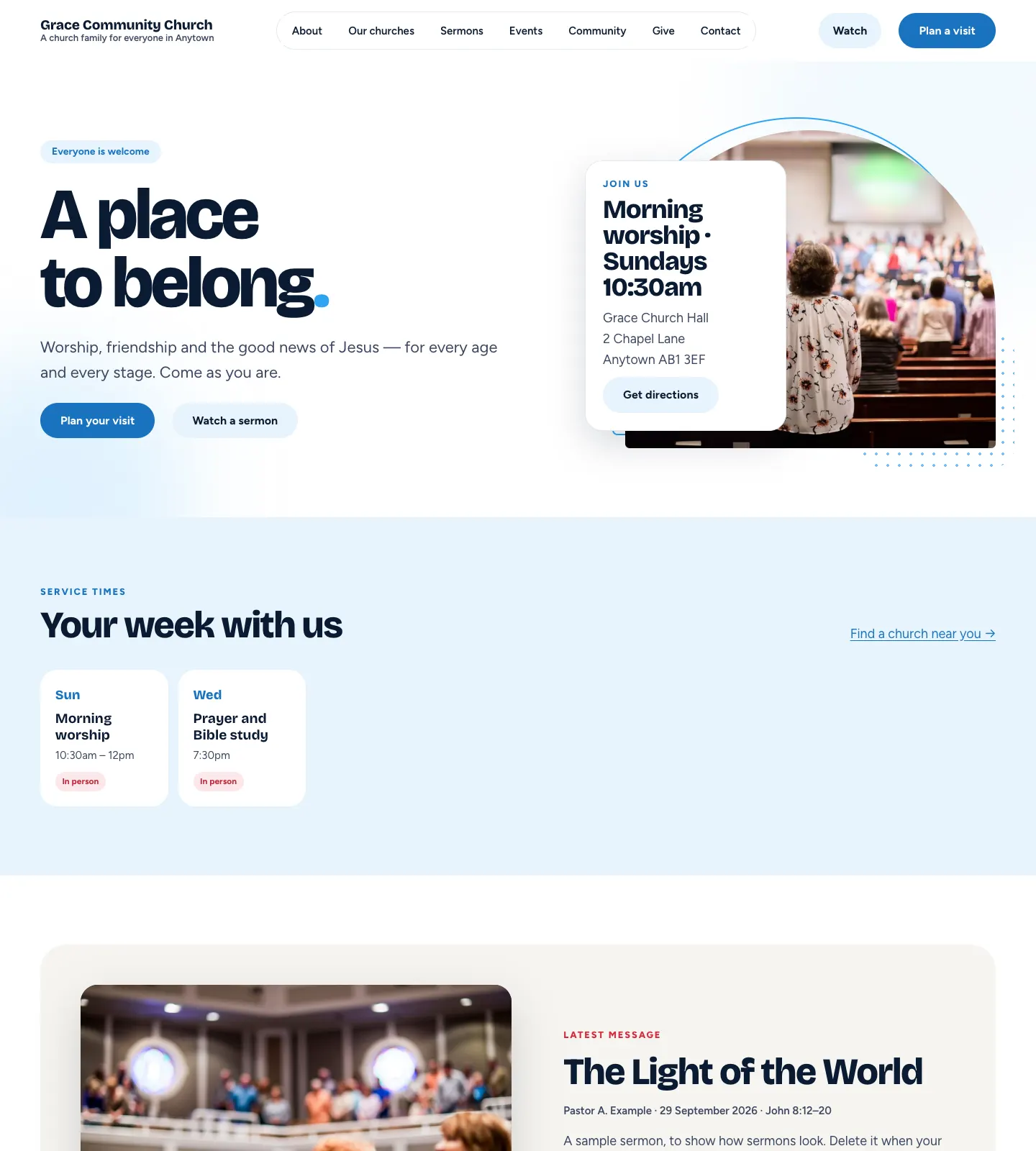
Heritage (warm, editorial)
Classic serif headlines on cream, square corners, navy and red. Feels like a well-made parish magazine.
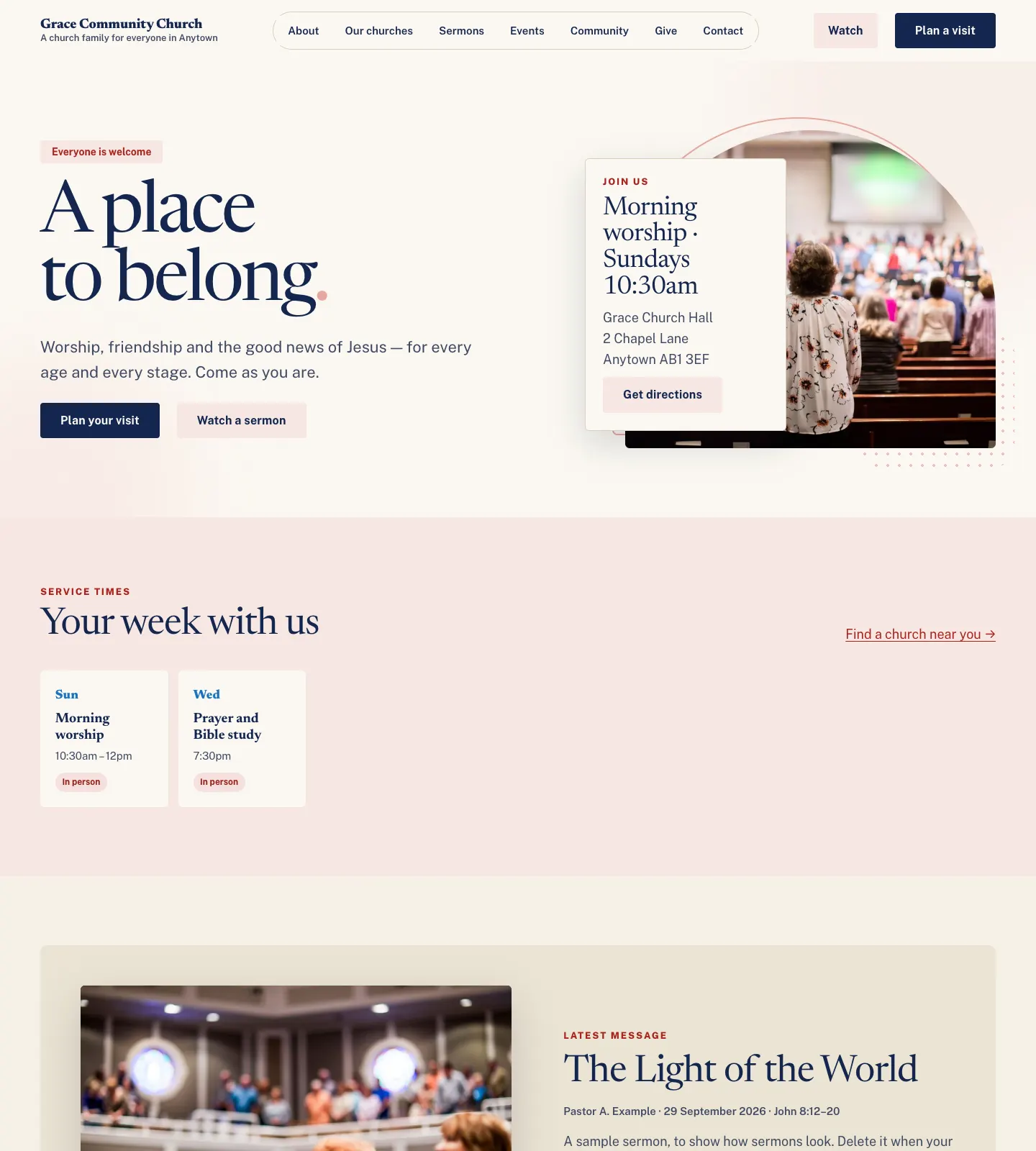
Nave (minimal, cathedral classic)
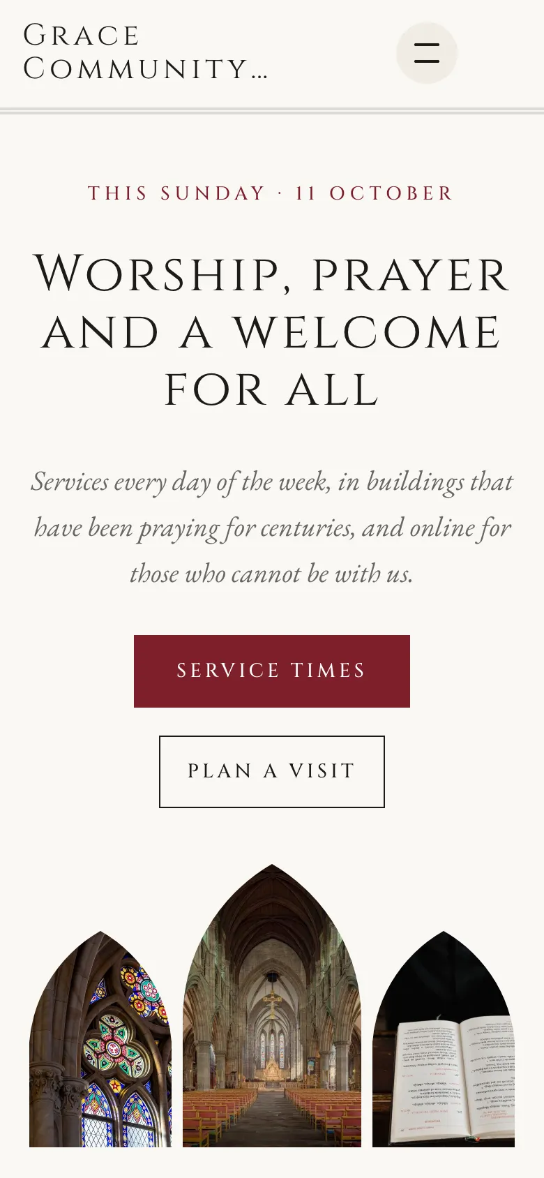
White stone, Roman capitals, a book serif, pointed arch picture frames, thin lines and one liturgical colour. For parishes, cathedrals and churches with a set order of service.
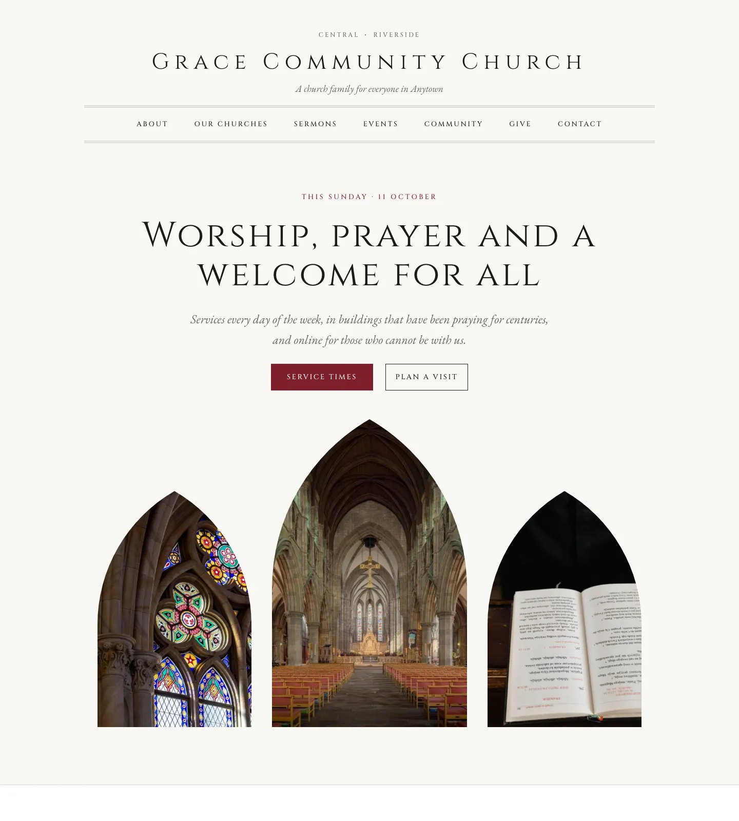
Parish (warm community, photo-led)
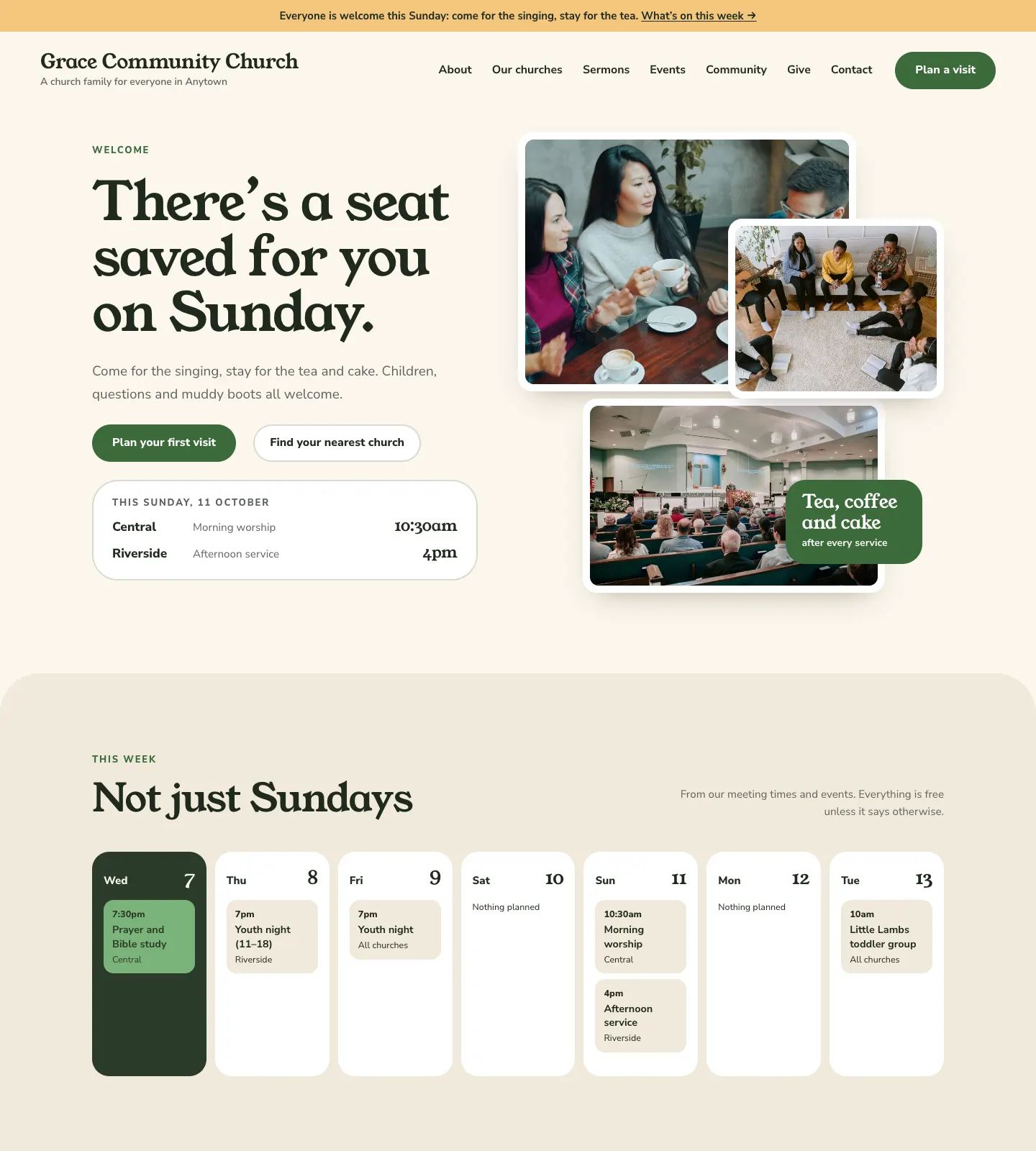
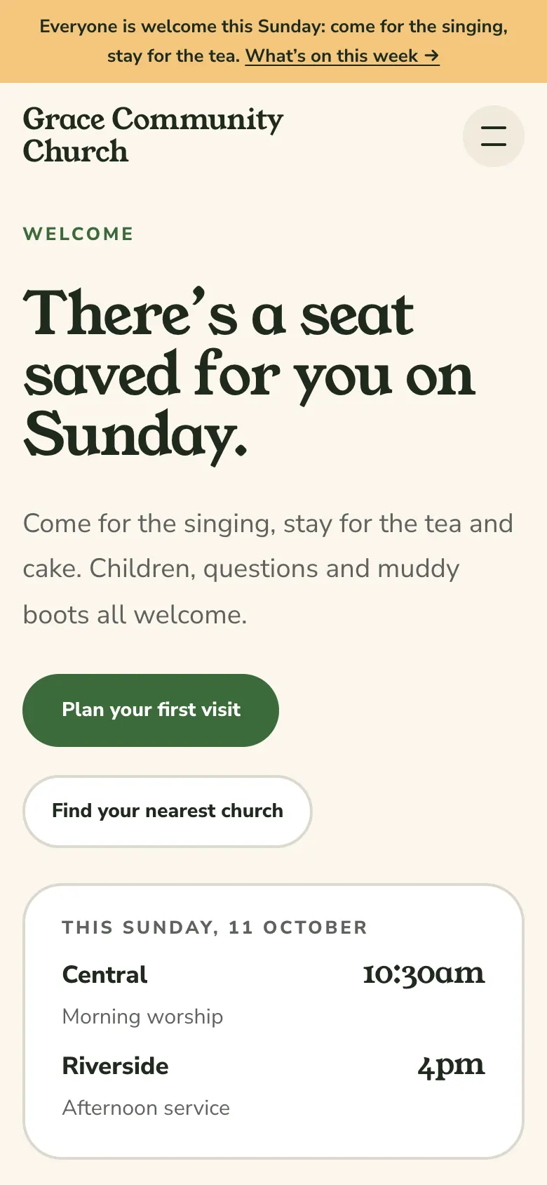
Photos shown as white-bordered prints, a friendly rounded serif, the week at a glance and soft cream. For churches whose life is the whole week, not just Sunday.
Pulse (contemporary, video-led)
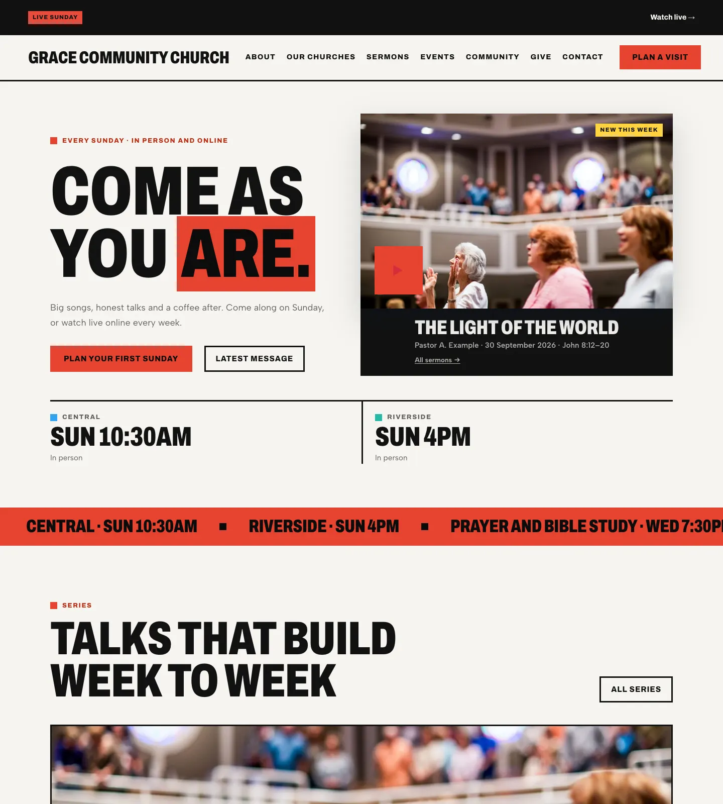
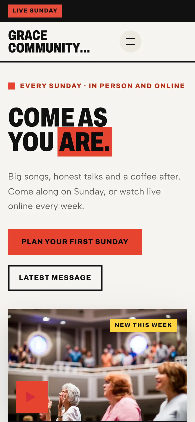
Tall condensed capitals, sharp rectangles, a scrolling ticker of service times and big play buttons on a bright page with black bands. For churches whose Sunday is streamed and whose sermons come in series.
Sanctuary (dark, cinematic)
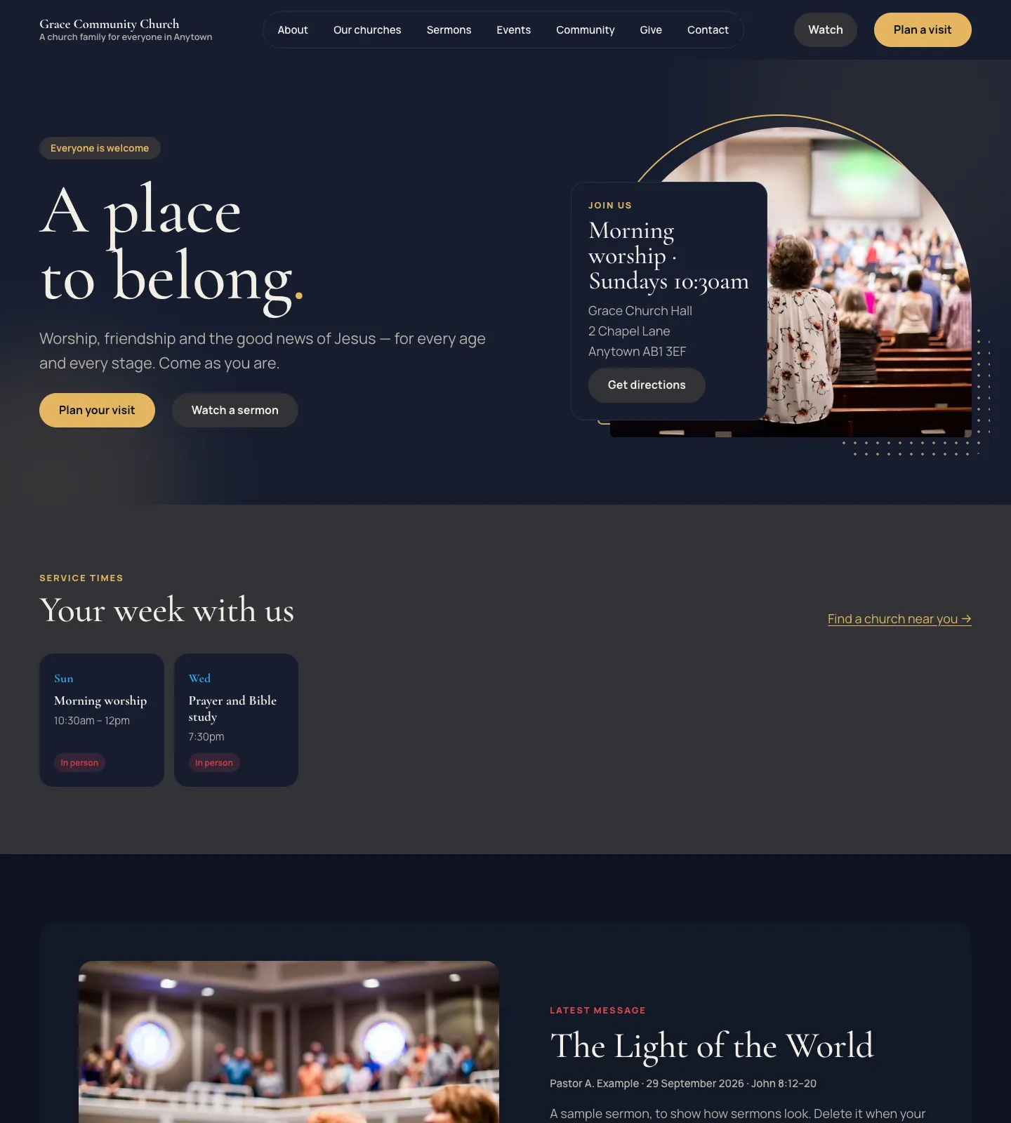
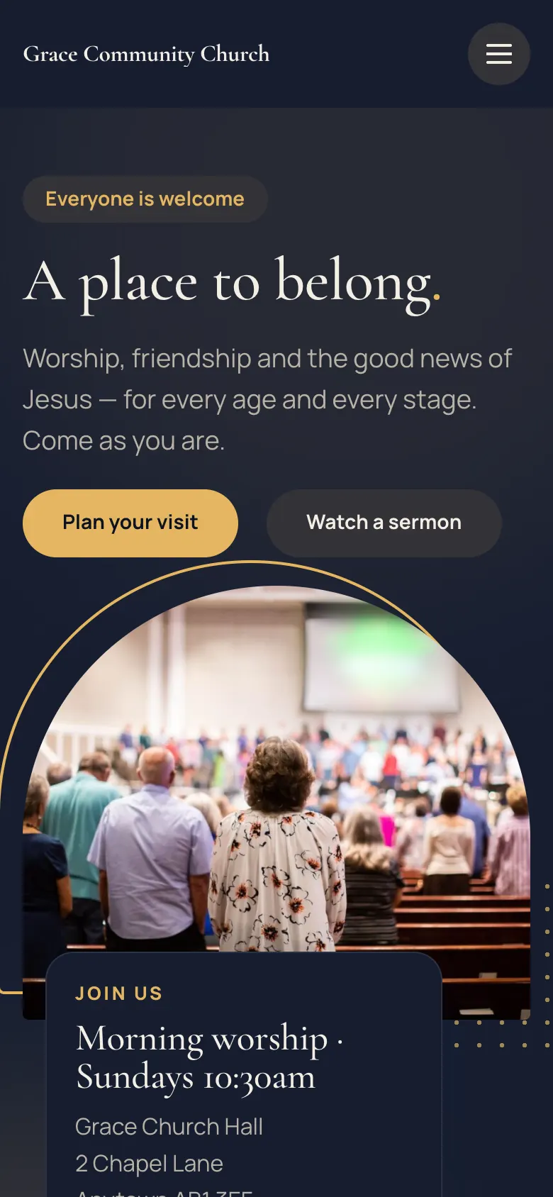
Dark backgrounds, elegant serif headings, full-width pictures and a single glowing accent.
The colour palettes
There are seven palettes: Sky (the default), Gold, Forest, Royal, Burgundy, Sunrise and Heritage navy & red. The design's own colours keeps each design's original colours. On the dark Sanctuary design the background stays dark and the palette colours the buttons, links and highlights.
On phones
Every design works on phones. The menu folds into a button at the top right, and the main button (Plan a visit) stays one tap away.

The pages the kit makes
The setup wizard adds these starter pages (you'll find them under Pages):
| Page | What's on it |
|---|---|
| Home | Welcome, next service, service times, latest sermon, what's on, ministries, community stories |
| About us | Your story and what you believe |
| Plan a visit | What to expect, the Plan a visit form, common questions |
| Our churches | Each church as a card, and every service time |
| Give | Ways to give, from Church → Settings → Giving |
| Prayer | The prayer request form (if you take requests) |
| Contact | Address, phone, email, service times |
| Questions | Frequently asked questions |
| News | Your blog posts |
| Privacy policy, Terms and conditions, Cookie policy | Starter legal pages filled in from your settings |
| Photo credits | Credits for the sample photos |
Each church also has its own page (for example Grace Church Central), made under Church → Churches. Sermons, events and community stories get their own list pages too: Sermons, Events and Community.
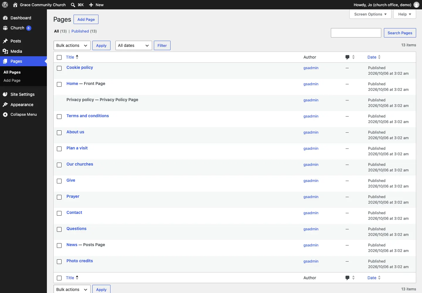
To change a page, open it from Pages, click any text or picture to change it, and click Save. See Pages and content.
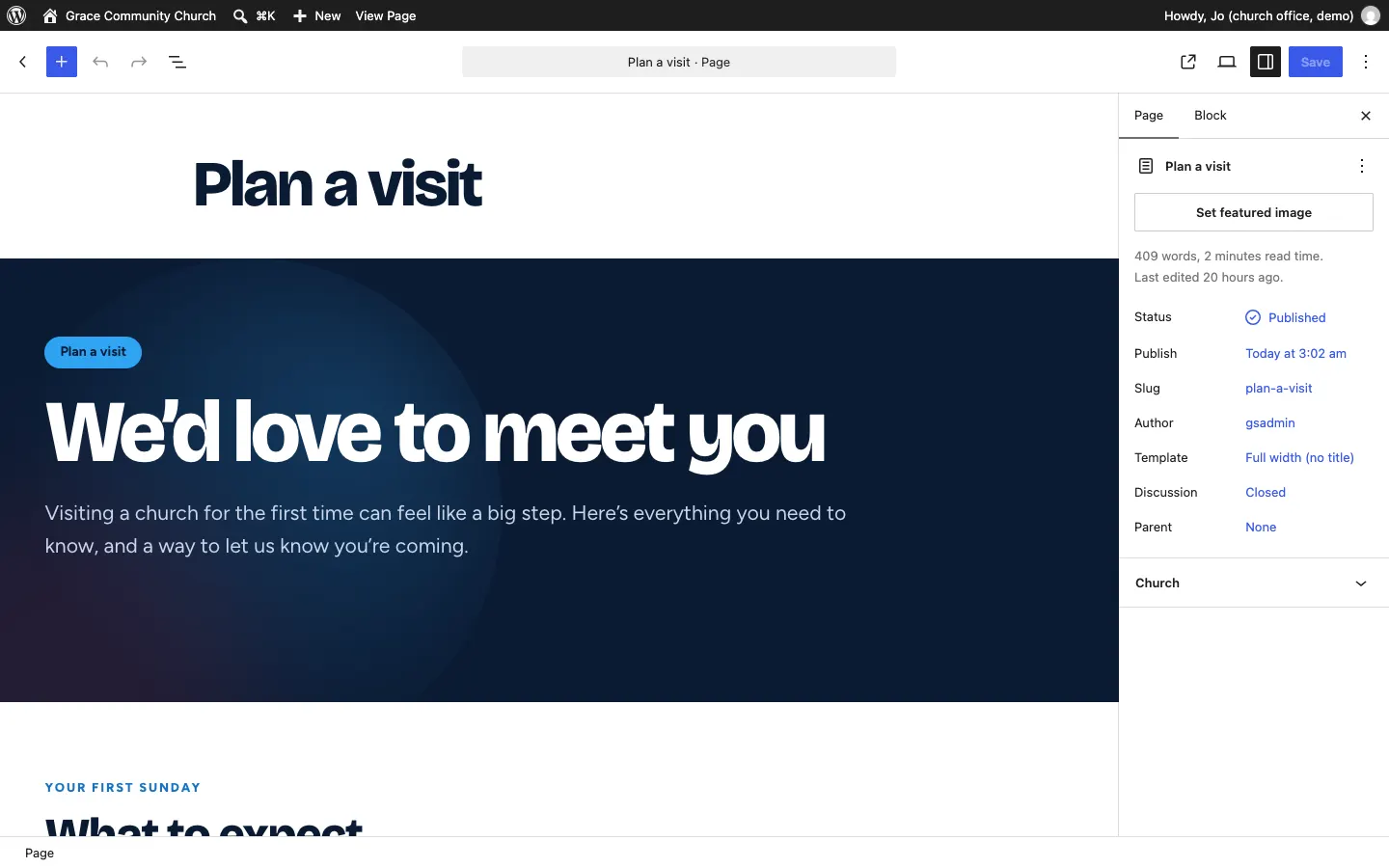
If you rename or replace one of these pages, tell the website which page is which under Church → Settings → Business → Pages, so its buttons and footer links still go to the right place. See Church settings.
The menu
The wizard makes a main menu with About, Our churches (only when you have more than one church), Sermons, Events, Community, Give and Contact. Beside it sit two buttons: Watch (your YouTube channel's live page) and Plan a visit. With a church app connected, a small Log in button can sit beside them too (see The staff sign-in page).
To change the menu, see Your look.